 javax.swing.GroupLayout
|
FlexDoc/Javadoc 2.0 Demo Java Doc |
|||||||||||||||
javax.swing.GroupLayoutEach group may contain any number of elements, where an element is a Group, Component, or gap. A gap can be thought of as an invisible component with a minimum, preferred and maximum size. In addition GroupLayout supports a preferred gap, whose value comes from LayoutStyle.
Elements are similar to a spring. Each element has a range as specified by a minimum, preferred and maximum. Gaps have either a developer-specified range, or a range determined by LayoutStyle. The range for Components is determined from the Component's getMinimumSize, getPreferredSize and getMaximumSize methods. In addition, when adding Components you may specify a particular range to use instead of that from the component. The range for a Group is determined by the type of group. A ParallelGroup's range is the maximum of the ranges of its elements. A SequentialGroup's range is the sum of the ranges of its elements.
GroupLayout treats each axis independently. That is, there is a group representing the horizontal axis, and a group representing the vertical axis. The horizontal group is responsible for determining the minimum, preferred and maximum size along the horizontal axis as well as setting the x and width of the components contained in it. The vertical group is responsible for determining the minimum, preferred and maximum size along the vertical axis as well as setting the y and height of the components contained in it. Each Component must exist in both a horizontal and vertical group, otherwise an IllegalStateException is thrown during layout, or when the minimum, preferred or maximum size is requested.
The following diagram shows a sequential group along the horizontal axis. The sequential group contains three components. A parallel group was used along the vertical axis.
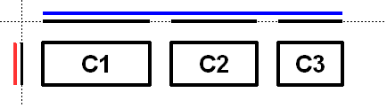
To reinforce that each axis is treated independently the diagram shows the range of each group and element along each axis. The range of each component has been projected onto the axes, and the groups are rendered in blue (horizontal) and red (vertical). For readability there is a gap between each of the elements in the sequential group.
The sequential group along the horizontal axis is rendered as a solid blue line. Notice the sequential group is the sum of the children elements it contains.
Along the vertical axis the parallel group is the maximum of the height of each of the components. As all three components have the same height, the parallel group has the same height.
The following diagram shows the same three components, but with the parallel group along the horizontal axis and the sequential group along the vertical axis.
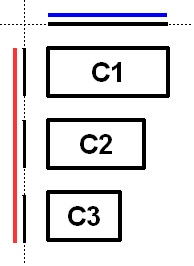
As c1 is the largest of the three components, the parallel group is sized to c1. As c2 and c3 are smaller than c1 they are aligned based on the alignment specified for the component (if specified) or the default alignment of the parallel group. In the diagram c2 and c3 were created with an alignment of LEADING. If the component orientation were right-to-left then c2 and c3 would be positioned on the opposite side.
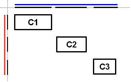
The following diagram shows a sequential group along both the horizontal and vertical axis.
GroupLayout provides the ability to insert gaps between Components. The size of the gap is determined by an instance of LayoutStyle. This may be turned on using the setAutoCreateGaps method. Similarly, you may use the setAutoCreateContainerGaps method to insert gaps between components that touch the edge of the parent container and the container.
The following builds a panel consisting of two labels in one column, followed by two textfields in the next column:
   JComponent panel = ...;
   GroupLayout layout = new GroupLayout(panel);
   panel.setLayout(layout);

   // Turn on automatically adding gaps between components
   layout.setAutoCreateGaps(true);

   // Turn on automatically creating gaps between components that touch
   // the edge of the container and the container.
   layout.setAutoCreateContainerGaps(true);

   // Create a sequential group for the horizontal axis.

   GroupLayout.SequentialGroup hGroup = layout.createSequentialGroup();

   // The sequential group in turn contains two parallel groups.
   // One parallel group contains the labels, the other the text fields.
   // Putting the labels in a parallel group along the horizontal axis
   // positions them at the same x location.
   //
   // Variable indentation is used to reinforce the level of grouping.
   hGroup.addGroup(layout.createParallelGroup().
            addComponent(label1).addComponent(label2));
   hGroup.addGroup(layout.createParallelGroup().
            addComponent(tf1).addComponent(tf2));
   layout.setHorizontalGroup(hGroup);

   // Create a sequential group for the vertical axis.
   GroupLayout.SequentialGroup vGroup = layout.createSequentialGroup();

   // The sequential group contains two parallel groups that align
   // the contents along the baseline. The first parallel group contains
   // the first label and text field, and the second parallel group contains
   // the second label and text field. By using a sequential group
   // the labels and text fields are positioned vertically after one another.
   vGroup.addGroup(layout.createParallelGroup(Alignment.BASELINE).
            addComponent(label1).addComponent(tf1));
   vGroup.addGroup(layout.createParallelGroup(Alignment.BASELINE).
            addComponent(label2).addComponent(tf2));
   layout.setVerticalGroup(vGroup);
When run the following is produced.
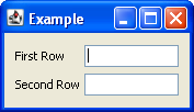
This layout consists of the following.
Nested Class Summary |
||
static enum |
Enumeration of the possible ways ParallelGroup can align
its children.
|
|
abstract class |
Group provides the basis for the two types of
operations supported by GroupLayout: laying out
components one after another (SequentialGroup)
or aligned (ParallelGroup).
|
|
class |
A Group that aligns and sizes its children.
|
|
class |
A Group that positions and sizes its elements
sequentially, one after another.
|
|
Field Summary |
||
static final int |
Indicates the size from the component or gap should be used for a
particular range value.
|
|
static final int |
Indicates the preferred size from the component or gap should
be used for a particular range value.
|
|
Constructor Summary |
||
|
GroupLayout(Container host)
Creates a GroupLayout for the specified Container.
|
Method Summary |
||
void |
Notification that a Component has been added to
the parent container.
|
|
void |
Notification that a Component has been added to
the parent container.
|
|
|
createBaselineGroup(boolean resizable, boolean anchorBaselineToTop)
Creates and returns a ParallelGroup that aligns its
elements along the baseline.
|
||
|
Creates and returns a ParallelGroup with an alignment of
Alignment.LEADING.
|
||
|
createParallelGroup(GroupLayout.Alignment alignment)
Creates and returns a ParallelGroup with the specified
alignment.
|
||
|
createParallelGroup(GroupLayout.Alignment alignment, boolean resizable)
Creates and returns a ParallelGroup with the specified
alignment and resize behavior.
|
||
|
Creates and returns a SequentialGroup.
|
||
boolean |
Returns true if gaps between the container and components that
border the container are automatically created.
|
|
boolean |
Returns true if gaps between components are automatically
created.
|
|
boolean |
Returns whether component visibility is considered when sizing and
positioning components.
|
|
float |
getLayoutAlignmentX(Container parent)
Returns the alignment along the x axis.
|
|
float |
getLayoutAlignmentY(Container parent)
Returns the alignment along the y axis.
|
|
|
Returns the LayoutStyle used for calculating the preferred
gap between components.
|
||
void |
invalidateLayout(Container parent)
Invalidates the layout, indicating that if the layout manager
has cached information it should be discarded.
|
|
void |
layoutContainer(Container parent)
Lays out the specified container.
|
|
void |
Forces the specified components to have the same size
regardless of their preferred, minimum or maximum sizes.
|
|
void |
Forces the specified components to have the same size along the
specified axis regardless of their preferred, minimum or
maximum sizes.
|
|
|
maximumLayoutSize(Container parent)
Returns the maximum size for the specified container.
|
||
|
minimumLayoutSize(Container parent)
Returns the minimum size for the specified container.
|
||
|
preferredLayoutSize(Container parent)
Returns the preferred size for the specified container.
|
||
void |
removeLayoutComponent(Component component)
Notification that a Component has been removed from
the parent container.
|
|
void |
Replaces an existing component with a new one.
|
|
void |
setAutoCreateContainerGaps(boolean autoCreateContainerPadding)
Sets whether a gap between the container and components that
touch the border of the container should automatically be
created.
|
|
void |
setAutoCreateGaps(boolean autoCreatePadding)
Sets whether a gap between components should automatically be
created.
|
|
void |
setHonorsVisibility(boolean honorsVisibility)
Sets whether component visibility is considered when sizing and
positioning components.
|
|
void |
Sets whether the component's visibility is considered for
sizing and positioning.
|
|
void |
Sets the Group that positions and sizes
components along the horizontal axis.
|
|
void |
setLayoutStyle(LayoutStyle layoutStyle)
Sets the LayoutStyle used to calculate the preferred
gaps between components.
|
|
void |
Sets the Group that positions and sizes
components along the vertical axis.
|
|
|
toString()
Returns a string representation of this GroupLayout.
|
||
Methods inherited from class java.lang.Object |
public GroupLayout |
(Container host) |
public void setHonorsVisibility |
(boolean honorsVisibility) |
A value of false is useful when the visibility of components is dynamically adjusted and you don't want surrounding components and the sizing to change.
The specified value is used for components that do not have an explicit visibility specified.
The default is true.
public boolean getHonorsVisibility |
() |
public void setHonorsVisibility |
If component is not a child of the Container this GroupLayout is managing, it will be added to the Container.
public void setAutoCreateGaps |
(boolean autoCreatePadding) |
public boolean getAutoCreateGaps |
() |
public void setAutoCreateContainerGaps |
(boolean autoCreateContainerPadding) |
public boolean getAutoCreateContainerGaps |
() |
public void setHorizontalGroup |
(GroupLayout.Group group) |
public void setVerticalGroup |
(GroupLayout.Group group) |
public GroupLayout.SequentialGroup createSequentialGroup |
() |
public GroupLayout.ParallelGroup createParallelGroup |
() |
public GroupLayout.ParallelGroup createParallelGroup |
(GroupLayout.Alignment alignment) |
public GroupLayout.ParallelGroup createParallelGroup |
(GroupLayout.Alignment alignment, boolean resizable) |
Baseline alignment is only useful when used along the vertical axis. A ParallelGroup created with a baseline alignment along the horizontal axis is treated as LEADING.
Refer to ParallelGroup for details on the behavior of baseline groups.
public GroupLayout.ParallelGroup createBaselineGroup |
(boolean resizable, boolean anchorBaselineToTop) |
public void linkSize |
(Component... components) |
This can be used multiple times to force any number of components to share the same size.
Linked Components are not be resizable.
public void linkSize |
(int axis, Component... components) |
This can be used multiple times to force any number of components to share the same size.
Linked Components are not be resizable.
public void replace |
public void setLayoutStyle |
(LayoutStyle layoutStyle) |
public LayoutStyle getLayoutStyle |
() |
public void addLayoutComponent |
public void removeLayoutComponent |
(Component component) |
public Dimension preferredLayoutSize |
(Container parent) |
public Dimension minimumLayoutSize |
(Container parent) |
public void layoutContainer |
(Container parent) |
public void addLayoutComponent |
public Dimension maximumLayoutSize |
(Container parent) |
public float getLayoutAlignmentX |
(Container parent) |
public float getLayoutAlignmentY |
(Container parent) |
public void invalidateLayout |
(Container parent) |
public String toString |
() |
|
FlexDoc/Javadoc 2.0 Demo Java Doc |
|||||||||||||||